Create Your First Project
Start adding your projects to your portfolio. Click on "Manage Projects" to get started


R&C Shop
Project type
Product Design
Date
October 2025
Location
London, UK
Role
Solo product/service designer
Case study for KCL Product Accelerator focusing on a client's cosmetics e-commerce website, using User-Centered Design principles to enhance user experience.
Rationale
R&C Store is an e-commerce shop selling natural cosmetics and food supplements.
It has been around for 3 years, but is yet to reach commercial success. The founders have excellent expertise in sourcing high-quality products, but, coming from a B2B world, struggle to articulate the virtues of their products to the end consumers.
This case study focuses on their shop, and looks at using User-Centered Design to improve the current offering.
Website link: https://randcstore.com/

User Needs and Goals
There are many potential user types for cosmetics, consuming the product and information about the product in radically different ways. On a highest possible level, they can be roughly classified into two types.
Experimentalists are always looking for the next thing. They want to try out a range of scents, effects, colours, and brands, and like the process of discovery.
Steady consumers are extremely conservative (the cost of making the wrong choice is surprisingly painful - after a new shampoo causes your scalp to itch for a week, you become extremely choice-averse). They will often spend a lot of time on research, but once they find their brand they can stay loyal for years.
Users can flip between both states relatively easily ("I have bought the same toothpaste for years, but am looking for a new mouthwash, so will try like 10"). Users also tend to be agnostic about where they buy the product from.
All users have multiple goals, but the relevant goals where they combine with the goals of R&C Enterprises are:
Experimentalists want a way to navigate the market offerings, flipping between different options with relative ease and understand what they are buying and how one product is different from the other.
Steady consumers want to find the cheapest source of the product they are going to buy anyway.
.png)
Usability testing findings
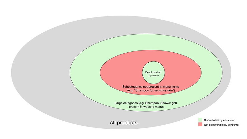
For this case study, I decided to focus on Experimentalists and discoverability of products on the website, as it is much more under control of the company, as opposed to wider market trends. I asked participants to first find a specific product, then another complimentary product, and a thrid unrelated product, describing them in different ways.
The findings showed a clear gap in the shop's navigational functionality - users had no issue finding a specific product and navigating to wide categories of products; but were unable to find more specialised products at all.
Actions
Two actions are necessary to solve this gap.
The obvious straightforward and uncontroversial one is to work with the website platform to fix the search function, which is currently outputting odd results.
The less obvious one is to help users with navigation outside of a search bar. Several quick sketches are included below.


Recommendation
Of the three sketches, Section 3 is the least intrusive and most plausable. I recommend implementing a tagging system within the website for easier navigation, and running usability tests from there on.